Wicklog 25: load it faster, draw it fewer, show it better
Happy new year! It's been a good start for me, especially compared to the emotional wasteland of the last few months. I've started seeing a therapist, am surrounded by housemates who care about me, started a really really cool project (at the end of this post), and am putting together the pieces for another grant attempt.
I want to start out going through some technical stuff in this first section — feel free to skip to the end if you just want a sneak peek at what'll be coming down the pipe this year.
Optimization
Performance
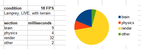
Crescent Loom has run up against some performance barriers; with more than a few creatures at once, it slows to a crawl. The first step when trying to make programs run faster is to look for bottlenecks and map out how long each part of the program takes. My assumption in this case was that it was the physics and brain simulations, since those were the heaviest places on math.
After running some tests, I was surprised to see that drawing of the graphics was actually the largest single chunk of time:
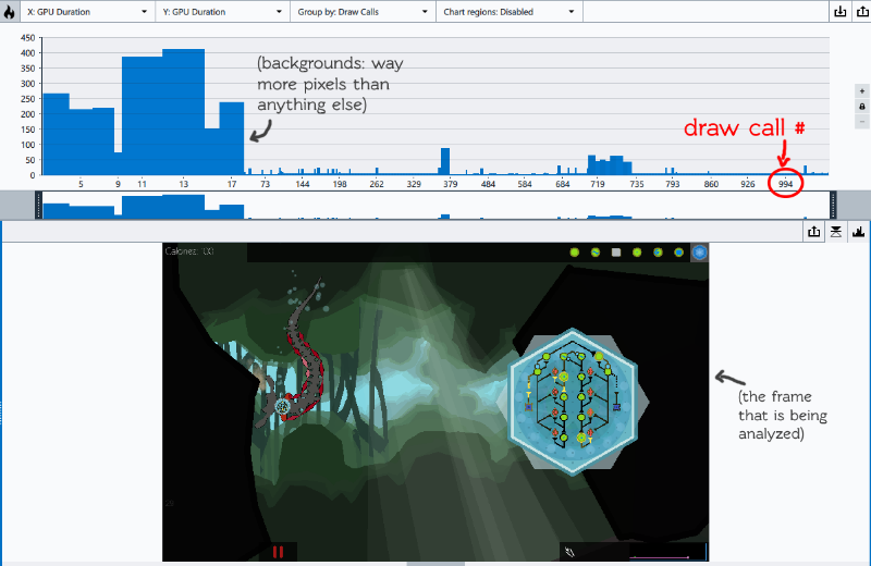
Researching graphics optimization (and using the frame-analyzer tool that Philip showed me at Stugan), I learned that there were two basic things you had to pay attention to in optimizing graphics: how many pixels you're actually putting down on the screen, and how many "draw calls" it takes to do so.
I found that my problem was that I had way too many draw calls — more than 1000 per frame. The computer can draw a whole bunch of different things at once as long as they're the same material, but if you change what you're drawing a lot, it spends more time "changing the color on its brush" than actually drawing.
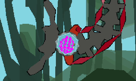
Since the way I had ordered drawing the brain caused multiple draw calls for each tile, drawing this tiny little brain (highlighted in pink) was taking a full 25% of the total draw time.
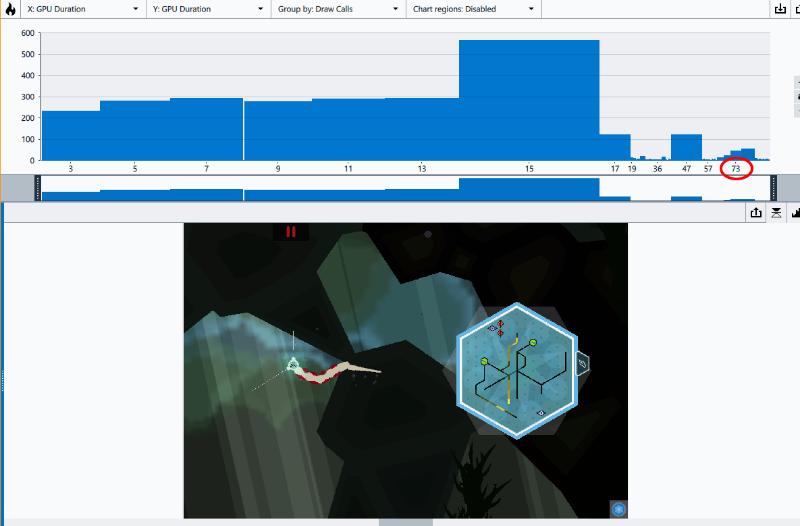
Long story short, I re-organized and eliminated graphical elements until that 1000+ draw calls was reduced to around 80. The biggest difference that you can see is the elimination of circles that were rounding out corners, since each time I switched between drawing a circle and a shape triggered a new draw call:
Load Times
The browser version of Crescent Loom takes about 30 seconds to load. This isn't terrible, but it's not great. Here's one of the points of feedback I recently got from a field test from the Brainstation folks I met at SfN:
Performance: it runs smooth but the loading times are fairly severe. My first grader was loosing interest during them.
I've never tried making something load faster, so I hoped that I could find some low-hanging fruit to improve this time. Much like the above section, I learned that there where two basic factors in loading: how large the files are, and how many separate files you have to request.
Again, I learned that my core download size is actually pretty small — about 5 MB, about the size of a single big gif. The problem was that they're spread across almost a hundred smaller scripts specifying each creature part, ion channel, etc.
The way this is solved with graphics is with spritesheets: you throw all your images into one large image and then draw just small parts of that image instead. I despaired until I realized I could do something similar with my text files. I wrote a small program that searched my entire data folder for .txt, .svg, and script files and saved them into one large text file, along with a "map" that gets the correct position in the large file from the original filename.

Long story short, condensing all these files down reduced load times by about half (if not more; it definitely depends on your connection speed):

Feelings
I have a particular feeling about doing this sort of technical optimization work.
On one hand, my very personal opinion is that life is TOO DANG SHORT to spend it mastering draw-call batching or munging text files. I'm frankly even a little upset that I now know what those phrases mean.
On the other hand, getting Crescent Loom running on low-end hardware means it's going to be much more accessible to everybody, which is something that I think is super important. It's hecka essential especially if I ever want to see Crescent Loom in a classroom environment, where the hardware going to be resource-limited. (in one field test, I saw a student using a laptop that just had a big hole in the screen — he would move the window around whenever he needed to see what was in that part of the screen)
Redesigns
My day job brought me to an Edward Tufte workshop at the beginning of December. Tufte is a classic designer whose message can be characterized as: "include as much relevant raw data as possible, but do it cleanly and as organized as possible". Good design doesn't have to be graphically polished; it's about taking away as much as you can to let your message show through with clarity.
For example, Craigslist would be masterpiece in his paradigm; there's a TON of data, but it's well-organized and dead-simple to use.

One of Tufte's recommendations was, whenever possible, to organize spatially instead of temporally. That is to say, show things side-by-side instead of one after the other. Don't hide what's going on in menus or tabs: spread it all out and guide the viewer by paying attention to their visual prominence. People will be able to figure it out easier if they don't have to page around to hunt for their information.
Neuron Panel
So I took a look at my own designs and noticed a place where I had erred particularly heavily in this regard: the neuron detail panel. There's a lot of stuff going on that is tricky to understand even for those trained in neuroscience, but it doesn't help that it only shows the activity of a single type of ion channel at a time.
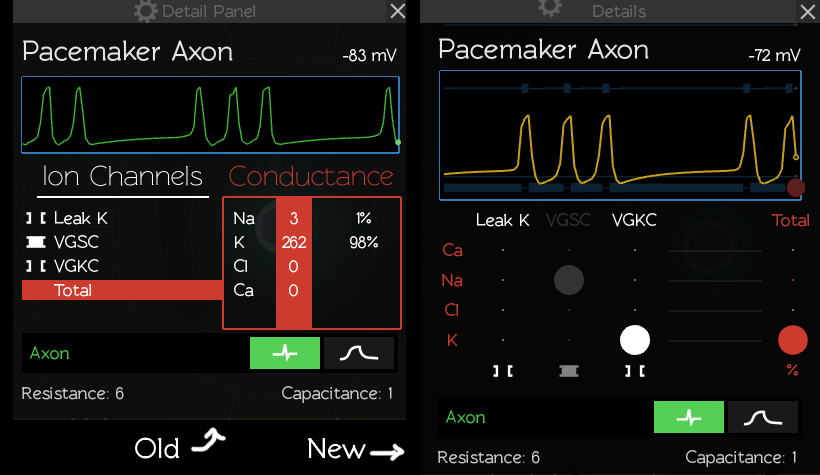
Since the numbers were only important in relation to each other, I replaced them with circle sizes. This allowed me to show the state of all the ion channels simultaneously, which allows one to understand the state of the entire neuron at a glance. I've also shown how ions relate to the activity of the cell by adding reversal potential lines to the graph itself.
You still have to have some neuroscience knowledge to really know what's going on, but I'm a lot happier with how much more readable this is.
Slider
And because I have a hard time actually learning my own lessons, I redid the sliders in the UI to be more ornate. I wanted it to imply some knitting / weaving verb, but I think it ended up a bit too unconventional.
Variations:
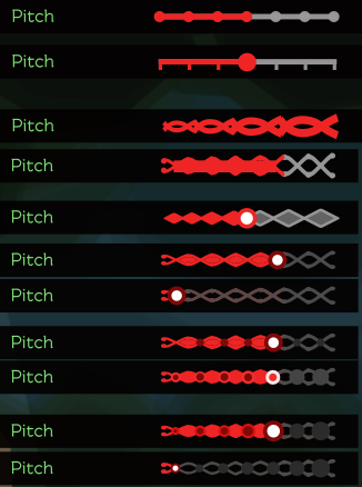
And final:
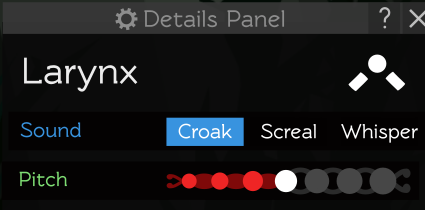
Show & tell:
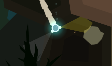
- Eyes now cast cones of sight instead of single lines:
- Some graphics errors I ran into while experimenting with seeing if I could skip some steps in the graphics renderer:
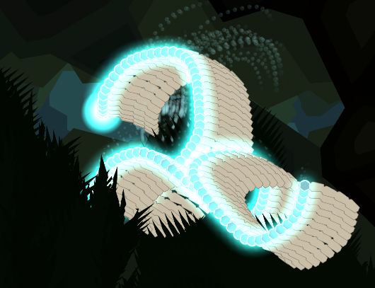
- New dust particles (& under-the-hood entire particle engine):

The single coolest thing I have ever made
I'm planning on making a slick video demo of this, but y'all can have this sneak peek. I finally met the folks at Backyard Brains this November, and got to see one of their prototypes in action: electrodes on your arm that let you control a video game character by directly flexing your muscles.
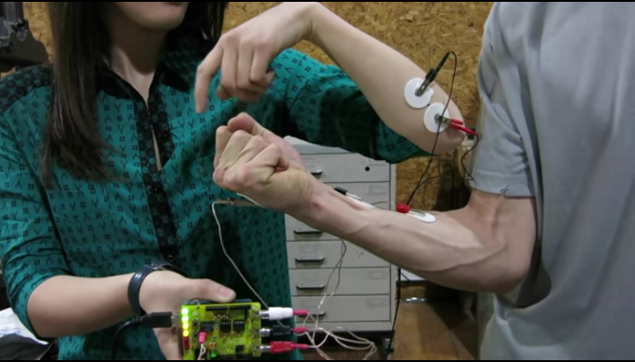
It hit me like a bolt — how cool would it be to control creatures with your own body? They were kind enough to let me special order one of these "neuroduinos", and it only took about an hour to get it integrated with Crescent Loom.
My housemate stumbled in on me cackling like a mad scientist and took this super grainy video:
Afterwards, we experimented with putting one electrode on each of our arms and working together to swim — each of us controlled the muscles on one half of the creature. If you've seen Pacific Rim, it 100% felt like that. I'm so excited to see how I end up being able to share this more widely.
Get Crescent Loom
Crescent Loom
Weave new underwater lifeforms.
| Status | On hold |
| Author | Olive |
| Genre | Simulation, Educational |
| Tags | 2D, artificial-intelligence, biology, Exploration, Moddable, nature, Non violent, Relaxing, underwater |
| Languages | English |
| Accessibility | Subtitles, Interactive tutorial |
More posts
- Changelog (all platforms) — Dec 3, 202516 days ago
- Changelog (HTML, PC, Mac) — Aug 1, 2023Aug 02, 2023
- Officially hitting 1.0Jan 02, 2023
- Changelog (HTML, PC) — Nov 3, 2022Nov 03, 2022
- Changelog (all platforms) — Aug 25, 2022Sep 25, 2022
- Changelog (html5) — July 26, 2022Jul 26, 2022
- Changelog (html5 & PC) — Nov 11, 2021Nov 05, 2021
- Changelog (html5) — October 11, 2021Oct 11, 2021
- Small bugfix (html5)Jun 26, 2021
- Changelog (HTML5 & PC) — June 21, 2021Jun 21, 2021
Leave a comment
Log in with itch.io to leave a comment.