Wicklog 23: Here's the plan
Back in the states. Stugan was great, friendship is the real treasure, etc.
Reflecting, one of the things I heard the most from visiting industry professionals & Stugan alumni was: "I came here thinking I'd finish my game in a year or so. It actually ended up taking 4 more years // I'm still working on it."
I don't want to be working on CL forever. I have other projects/games I'm excited to get to in my life. So here's setting an intentional & somewhat arbitrary goal: I want to wrap up the main development in the next three years (by the end of 2021). That's not a release date announcement, but I want to come up with a realistic plan to get that to happen. If at that point there's no end in sight, I will re-evaluate if I want to just move onto another project.
First off, at my current rate, I'm not going to meet that. I have a part-time web dev job which is necessary for paying my bills & building a financial buffer back up, but it heavily cuts into the hours per week I can develop CL. Also, it's high time I professionally brought other people onto the project. It's in dire need of an art & sound pass, and Stugan showed me how important it is to even just have one other person to discuss & design with.
So it looks like I need to secure enough funding to support / contract 1-5 people. This is outside the scope of Kickstarter; looking at my other options, it looks like need to either find a publisher or get a grant. Turning my attention towards fund-raising once again means that progress on the game itself is gonna grind to a halt, but the collaboration it enables later will more than make up for it in the long-term.
Grants are nice because you don't have to pay the money back, and Crescent Loom is an *excellent* fit for the handful of science education ones out there, so that's where I'm going to put my focus. I'll be putting together a calendar of grants & budgets & stuff for the next update.
Plus, I've been working on this thing non-stop for two years. It's time to take a bit of a break.
Design Pillars
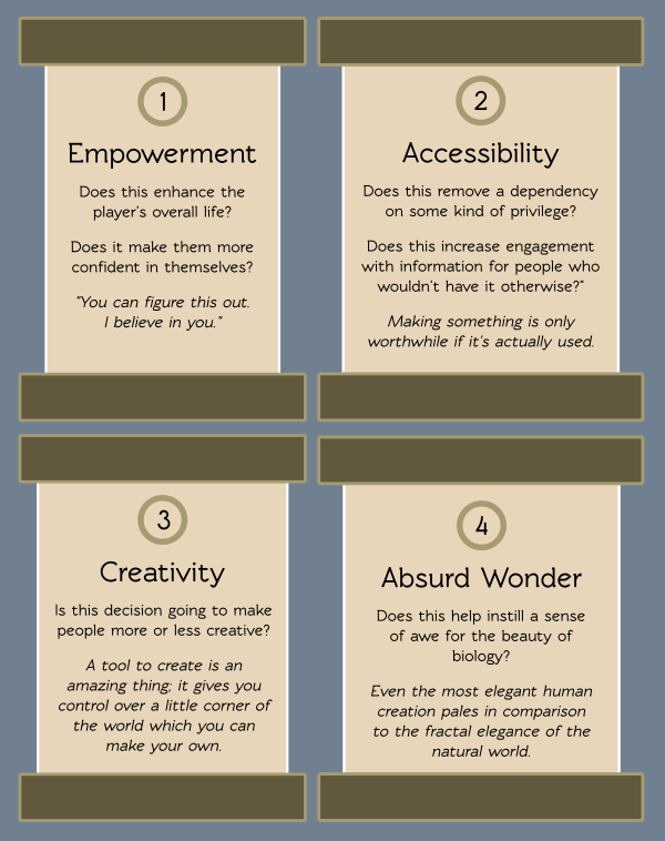
I've talked in the past about having a "design pillar" of accessibility, but realized at Stugan I hadn't actually fleshed out what that meant and what other pillars I might have. Here's my first draft, with corresponding questions that I should ask about any new feature or design decision:
Direction Through Subtraction
I finished a first draft of an expanded tutorial at Stugan; instead of the old single level which led you by the nose through making a creature in under four minutes using voiceover and flashing buttons...
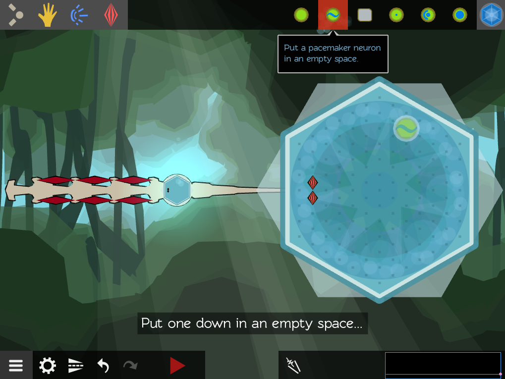
... the new tutorial teases out each individual concept into its own short challenge. And instead of flashing buttons to grab attention, it uses *direction through subtraction*; I simply remove all elements of the game except for the one I want to teach, and let the player figure it out through natural exploration.
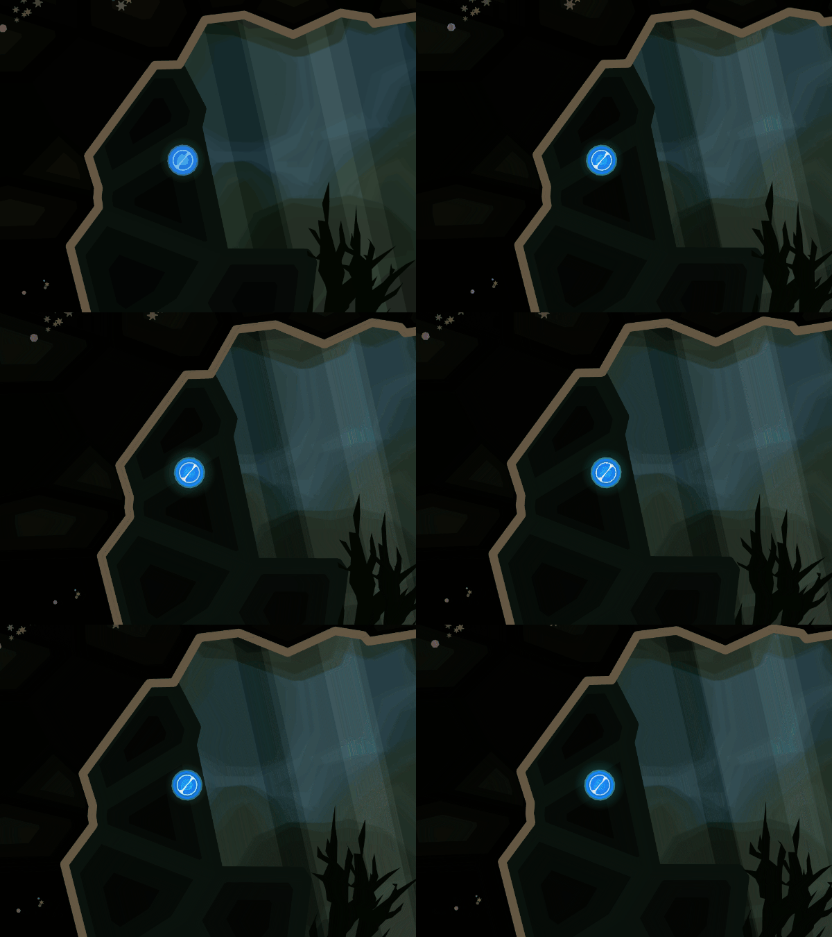
For example, let's take a look at the very first level. It opens up with no UI; just a floating egg in the water
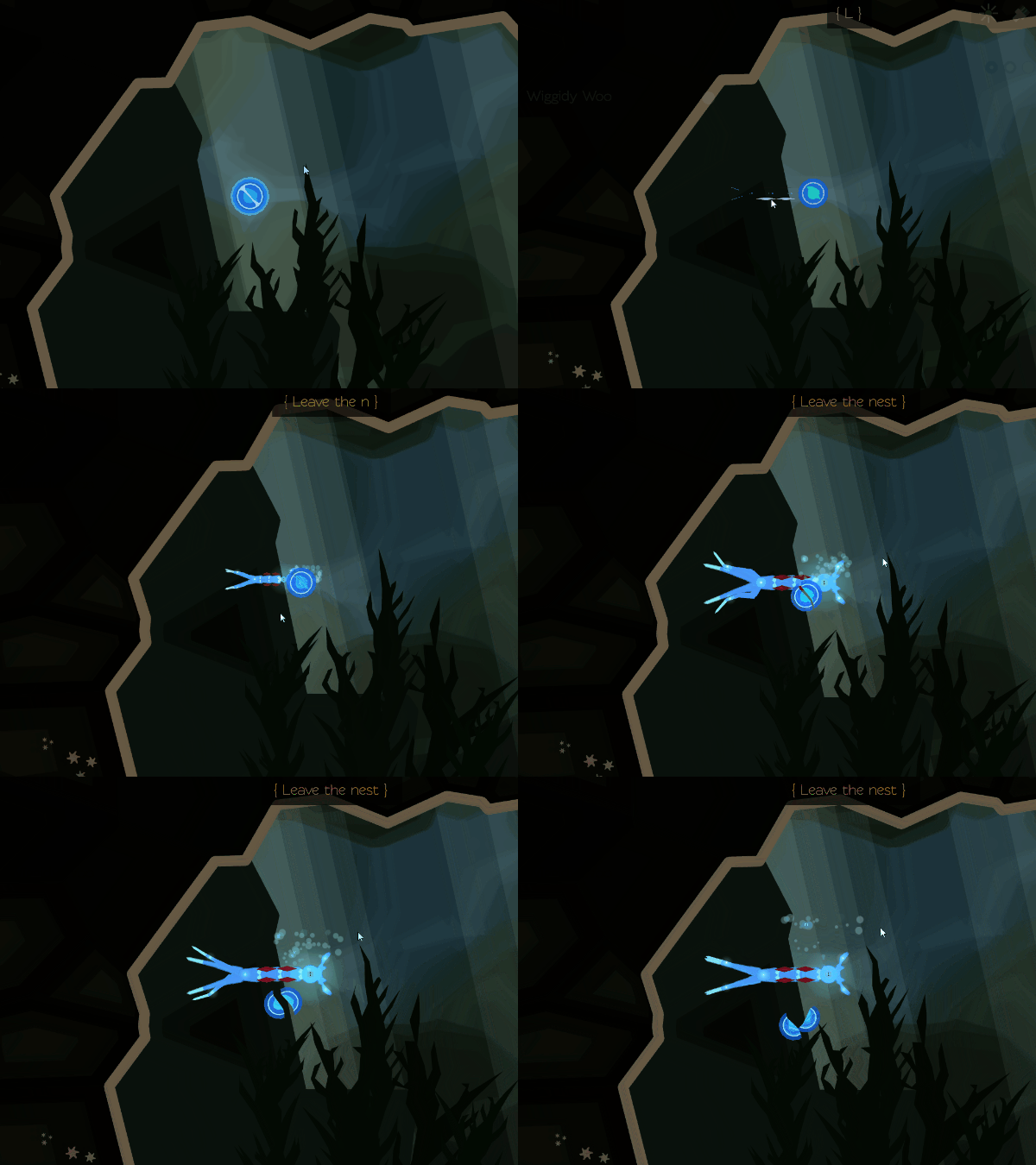
Pressing any key (or clicking on the egg, as most people do) will hatch the creature. Oh, exciting! But it doesn't seem to do anything after that?
So people move the mouse around the screen, clicking. They maybe experimentally press a few keys on the keyboard. Eventually, a they discover (helped by a tooltip on mouseover) that they can press the glowing center of the creature to open up the "brain".
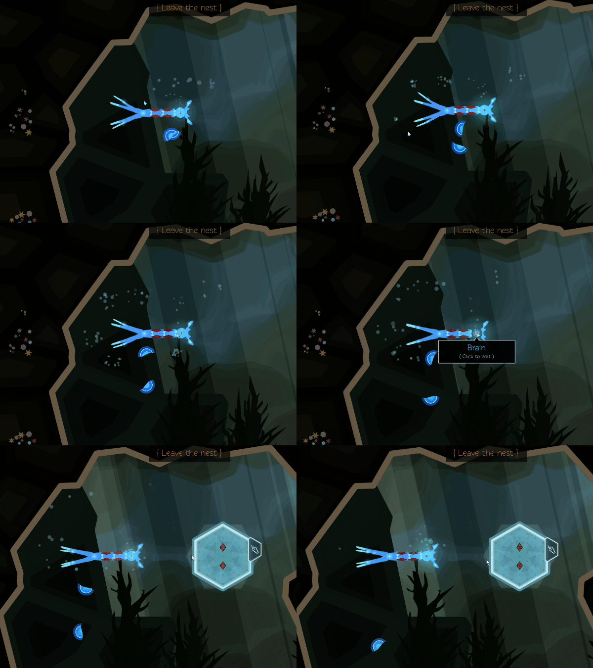
Whoa, what's all this, then? People would get distracted moving the two muscle neurons around, so I disabled the ability to do that this level. All that's left is this "stimulator" tool. So you pick it up and start trying to zap various things on the screen. Since zapping the creature directly doesn't do anything, you eventually try those two red diamonds in the brain.
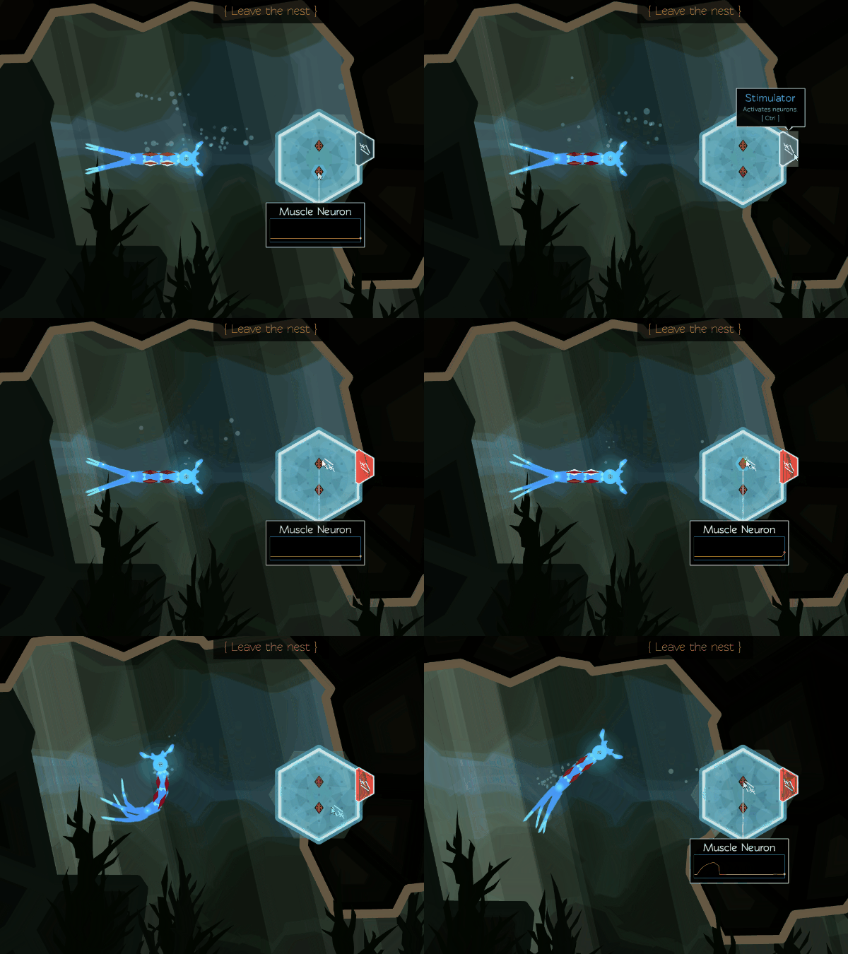
It twitched! Ohhhh, the muscle neurons control the muscles! And the other one makes it turn the other way... I can get it to swim!
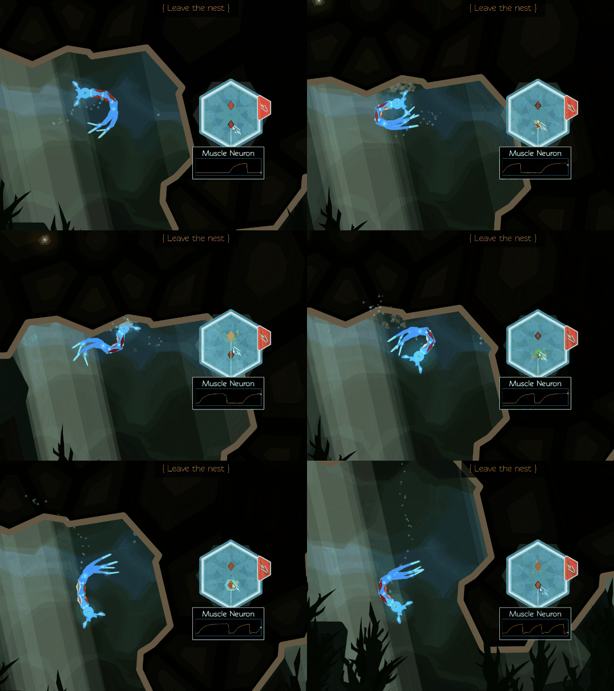
The level is very short, and they reach the end quickly. This is important; the game's not about manually stimulating muscles to navigate a large map. They've already had their moment of insight, so it's time to move onto the next thing.

Different People Want Different Things
Direction through subtraction is good because encourages exploration and discovery. However, it can be scary. "Am I doing the right thing?" is a real fear for many people. Referring back to design pillars #1 and #2, I'm going to need to find ways to encourage and prop up these players.
A trend in modern design is giving players control over what sort of experience they're looking for by letting them select from different "play modes" at the start of a game. Here's a good example from Subnautica:
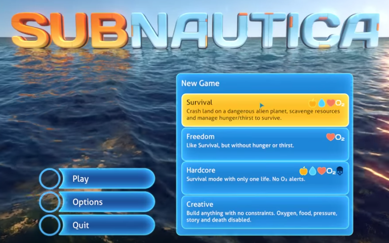
This evolved from the easy / medium / hard difficulty sliders, which had the problem of not giving any sort of context and feeling infantilizing to non-hardcore gamers. This design makes it clear what each one means & naming them in a way that validates the experience of different play-styles.
For Crescent Loom, where the difficulty comes not from resource limitations but from the understanding of the mechanics, these options could take the form of teaching styles. Does the player want to discover the mechanics on their own through trial-and-error, or be guided step-by-step through the process? I haven't seen other learning games do this before, so it would be amazing to consult with an educational specialist here.
Till next time!
— Wick
Get Crescent Loom
Crescent Loom
Weave new underwater lifeforms.
| Status | On hold |
| Author | Olive |
| Genre | Simulation, Educational |
| Tags | 2D, artificial-intelligence, biology, Exploration, Moddable, nature, Non violent, Relaxing, underwater |
| Languages | English |
| Accessibility | Subtitles, Interactive tutorial |
More posts
- Changelog (HTML, PC, Mac) — Aug 1, 2023Aug 02, 2023
- Officially hitting 1.0Jan 02, 2023
- Changelog (HTML, PC) — Nov 3, 2022Nov 03, 2022
- Changelog (all platforms) — Aug 25, 2022Sep 25, 2022
- Changelog (html5) — July 26, 2022Jul 26, 2022
- Changelog (html5 & PC) — Nov 11, 2021Nov 05, 2021
- Changelog (html5) — October 11, 2021Oct 11, 2021
- Small bugfix (html5)Jun 26, 2021
- Changelog (HTML5 & PC) — June 21, 2021Jun 21, 2021
- Wicklog 32: Refactors, race mode (again), and LoomapaloozaMay 25, 2021
Leave a comment
Log in with itch.io to leave a comment.