Wicklog 20: Exposing hidden mechanics, backwards compatibility, and Stugan
Stugan
I'm going to Sweden!! Stugan is a 2-month workshop for about 20 developers to focus on a goal while in a cabin out in the woods. They bring in mentors, and there's a focus on collaboration & making friends.
So... it's basically summer camp for game devs. :)
Part of the application was making a video that lays out my goals, which you can see here:
There's... not a lot you can do in just two months of development, so I set my scope for just making a better introduction to the game. It's a design I've been kicking around for a while: playing as a veterinarian and being presented with a series of creatures with some sort of physical or neural problem that you need to fix.
I see this setting as having a few key advantages:
- It's a natural framing device for a progression of puzzles; a novice vet is going to be handed creatures with simpler issues.
- It will allow me to show completed creatures to give players a baseline for what they look like, in contrast to the current method of throwing people in with a whole bunch of tools and not much idea what they're doing.
- Being a vet is a suuuuper common "I want to be X when I grow up!" dream, but there haven't been many games where you can be one. I suspect that it'll be a strong hook for kids.
I'll be leaving on June 22 and getting back around August 21, including 10 days after the workshop ends for just doing some hiking around the country. I am very, very happy to have been selected for this. Aghklhglbk ~
De-cluttered cell popup
I've been redesigning the system for interacting with neurons on the board every few months for the last year or so. The current iteration is to have a tooltip and little icons pop up when you mouse over them, like so:
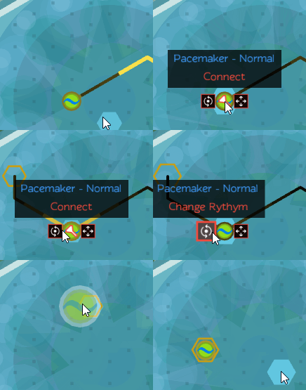
The main drawback to this is that when there's a lot of neurons, the view can get super cluttered — especially with that big blocky box of text covering everything above the cell:
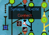
What are you even mousing over here? It's just madness.
So I bumped the label off to the side & made it more clear what each icon did, like so:
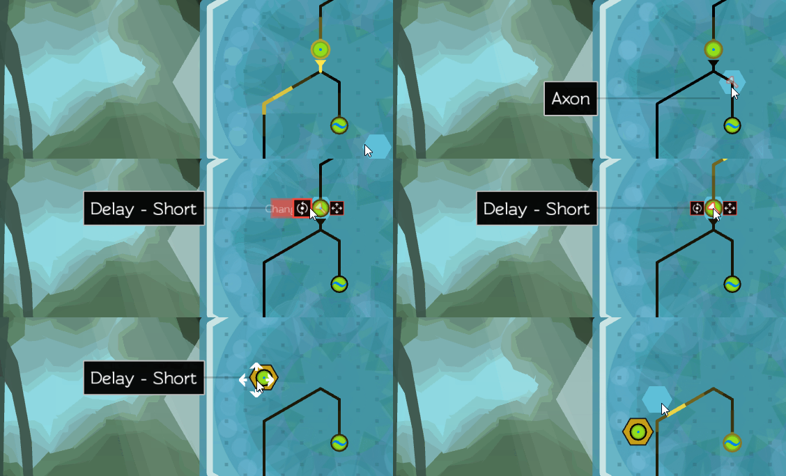
The key to making those orange tool labels strongly associated with their icon is that little slide animation they do. Coming out of the icon (as opposed to just fading in) emphasizes the attachment.
Detail Panels
Up til now, people have had to sorta take my word that there was lots of cool neuro stuff happening under Crescent Loom's hood — so I've spent the last month or so making a details panel where you can actually watch ion channels open and close during action potentials.
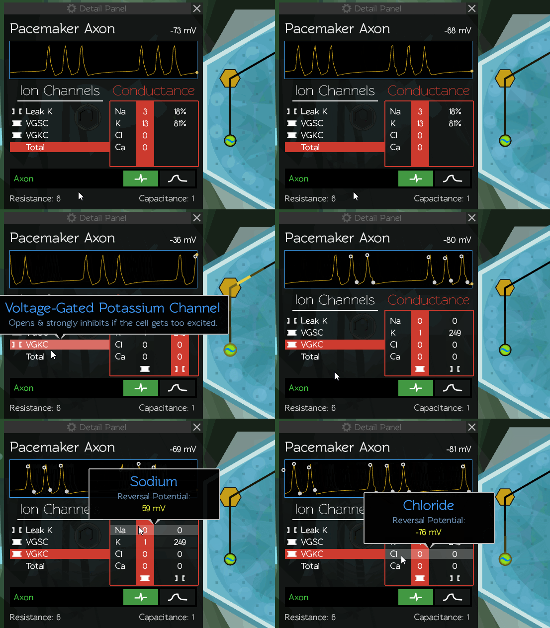
While working on panel, I went through one of those design cascades where you change one thing, which makes you realize you need to change another, etc. It started when I finished the first draft of the panel mock-up:
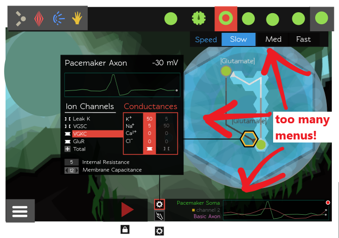
There's information all over the place! Plus, I never loved how the options menu popped out from the top bar. It worked fine for selecting new cells to place, but it was kind of weird that in order to change an option, you had to click on the neuron and then go back up to the top of the screen like you were placing a new one.
So I bumped the options menu into the details panel. And while I was at it, I restored the visual options for neurite and synapse types (which I'd killed last year in an effort to solve this same problem of too many menus in too many different places):
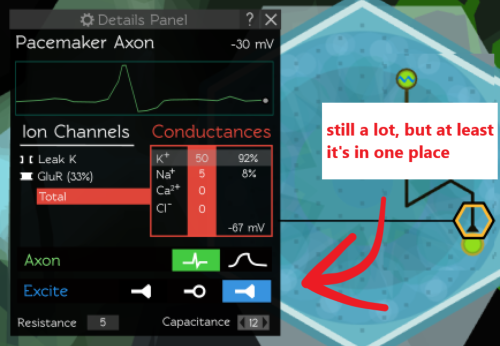
It was such a relief to get the option menus in one dedicated place instead of just being tacked-on to the tool bar. As it happened, I'd been struggling with the same problem with the body part menu, and the too-many-menus problem was currently way worse over there:
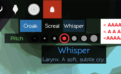
So I mocked up a corresponding "Limb Details Panel" that used the same format as the neuron's: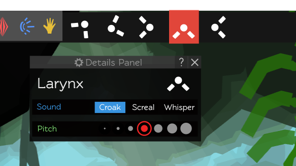
Making this limb panel got me thinking: right now I only have the capability to have a single multiple-choice set of options for cells (e.g. "Fast", "Medium", or "Slow"), but it'd be useful to be able to have that numerical slider that limbs have (e.g. the Pitch slider in the above screenshot). Also, being able to independently modify multiple properties in the same cell instead of just choosing from a few presets seems like an obviously useful thing to be able to do, in retrospect. It'd look something like this:
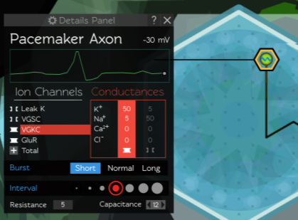
Changing this kind of thing always requires some amount of under-the-hood reshuffling of code. However, in this case things are complicated by the specter of backwards compatibility; how do I add this feature without breaking all the creatures that have already been saved by the old system?
I'll talk about the backwards compatibility issue more in the next section, but let's just appreciate the progression of things here: we started with a new bit of UI to display the inner workings of neurons, bounced around consolidating and standardizing the options system, and am now faced with potentially jeopardizing the save data of all the creatures made so far. Turns out that computer games are highly interconnected, complicated beasts.
Backwards compatibility
I got stuck going down a very technical rabbit-hole for a week or so: optimizing creature file sizes. Here's a small slice of what one currently looks like:
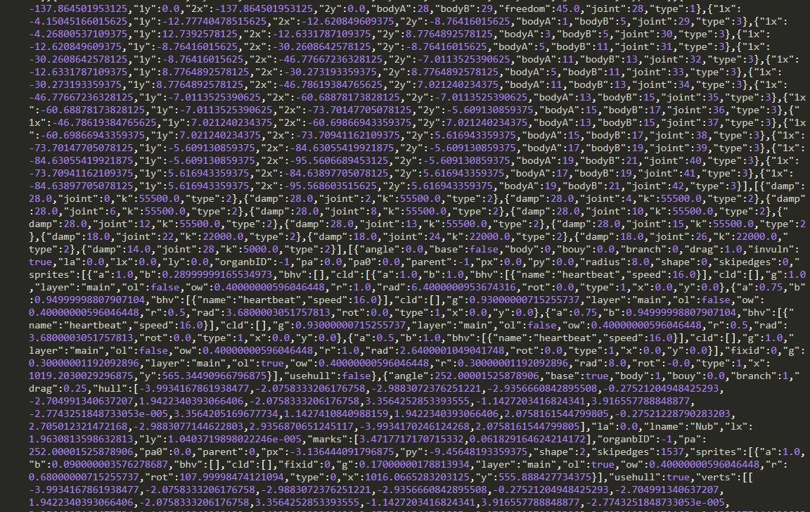
There's a ton of room for improvement even in this small slice:
- Replacing repeated labels like "bodyA" and "skipedges" for something shorter.
- I'm storing the vertices for the graphic sprites AND the physical bodies, essentially doubling the size needed for each limb.
- And possibly the biggest thing: reducing the length of all those decimal numbers! I really don't need to be storing values to the 14th decimal (that's the ten-trillionth place for those counting at home) — the 4th should be more than sufficient.
Cutting out duplicate information, changing labels, and setting a fixed decimal length took some work, but once again the really tricky part is figuring out what to do with all the previously-saved creatures. Do I abandon them? Do I write some kind of custom converter to translate them all into the new format? Do I let my loading functions just build up with a bunch of legacy options as I continue making changes over time?
Finding some way to preserve the current creatures will take work, and will ultimately be rendered obsolete anyway as I refine the format even more in the future. I am sure that I will inevitably someday hit a snag that will require just wiping out all the current data, so what's the point in preserving it for now? This has already happened once; the hundreds of creatures made with the first Kickstarter demo were impossible to keep after I switched from basic circles and squares to complex polygons
Then again, it feel bad to pour hours into a creation and then have it just thrown away, so I don't want deletions to just become a regular thing. I stopped playing Starbound after they left early access and wiped out my 100+ hours of building and exploration.
So I think I'll try to compromise. I'll preserve the current creatures for the time being, but set expectations by adding a "These will someday be deleted!" note to the save window.
MCCC visit
I mentioned back in March that I'd be demoing CL at an after-school program, and just got the pictures back today!
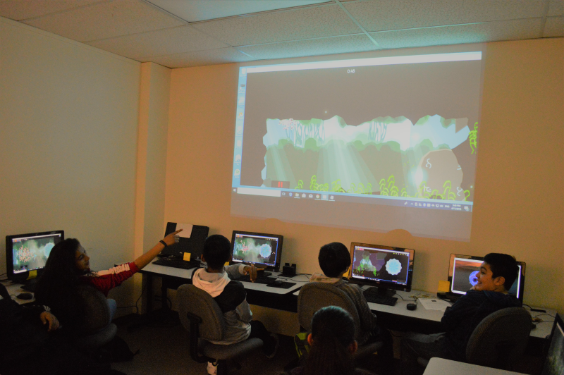
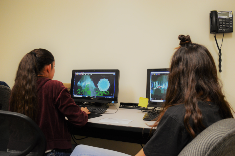
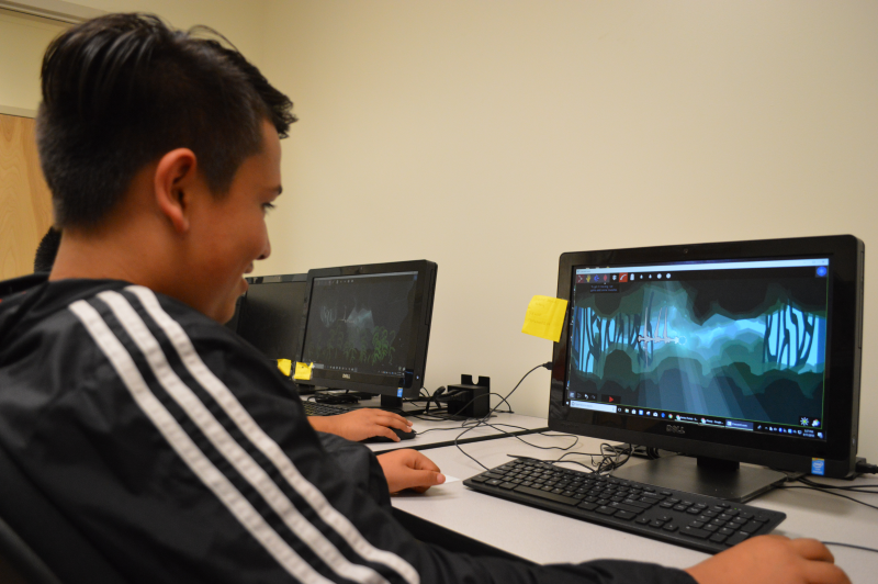
It struck me how similar running the session for middle-schoolers was to the time I ran it for undergraduates. People respond to similar incentives ("make a creature that can win a race!") and stumble into the same pitfalls (initially making something over-complicated).
Making a game that can work in the classroom is not for the faint-of-heart, but seeing kids have that moment of understanding, collaborate, and excitedly build cool stuff gives me hope that CL might be able to make it as a tool for educators.
Thanks for reading! :)
Wick
Get Crescent Loom
Crescent Loom
Weave new underwater lifeforms.
| Status | On hold |
| Author | Olive |
| Genre | Simulation, Educational |
| Tags | 2D, artificial-intelligence, biology, Exploration, Moddable, nature, Non violent, Relaxing, underwater |
| Languages | English |
| Accessibility | Subtitles, Interactive tutorial |
More posts
- Changelog (all platforms) — Dec 3, 20254 days ago
- Changelog (HTML, PC, Mac) — Aug 1, 2023Aug 02, 2023
- Officially hitting 1.0Jan 02, 2023
- Changelog (HTML, PC) — Nov 3, 2022Nov 03, 2022
- Changelog (all platforms) — Aug 25, 2022Sep 25, 2022
- Changelog (html5) — July 26, 2022Jul 26, 2022
- Changelog (html5 & PC) — Nov 11, 2021Nov 05, 2021
- Changelog (html5) — October 11, 2021Oct 11, 2021
- Small bugfix (html5)Jun 26, 2021
- Changelog (HTML5 & PC) — June 21, 2021Jun 21, 2021

Comments
Log in with itch.io to leave a comment.
looks interesting... i liked