Lancer Tactics
Mech recoloring & dialogue layout crisis of faith
Dialogue layout crisis of faith
Every so often, I'll run into something in development that eats away at me until it pushes me to a crisis of faith and I have a breakdown, burn down a bunch of work, and build something better from the ashes. These are moments of transformation and we're almost always able to come out the other side with something dramatically better than what we started with.
This all sounds very dramatic until you take a step back and see the issue in question is just, like, the layout of a menu. But if medieval priests were able to have schisms over angels on pins I can have strong feelings about graphic design, dammit!!
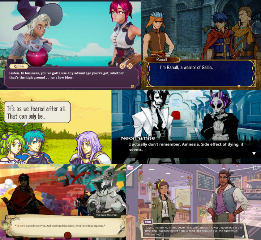
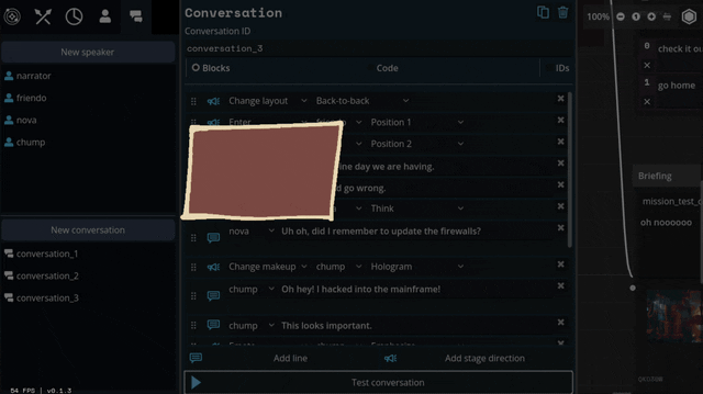
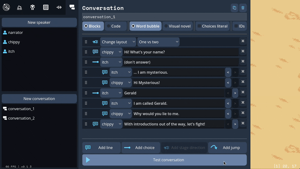
This month's episode revolved around how we're doing character dialogue. For reference the plan was to do a standard 4-slot visual-novel talking heads layout. I call it a 4-slot because there's usually four positions that characters can stand; two on the left, two on the right:
I had it ingame, and it was working. But... something felt off. Do you see the difference between every one of the above examples and this?
It's all about perspective, baby.
Answer: all the character art in those examples are drawn at a slight angle so they can be flipped back and forth to be made like they're looking at each other.
Trying to do this with the perspective we chose early — straight on — makes for a chorus line of weirdos who are looking directly into your soul as they ostensibly chat with each other. Credulity is strained; the illusion of these puppets interacting in the same space is paper-thin.
(I was skeptical of choosing this perspective for this reason, but we ultimately went with it to make the customizable assets in the portrait maker easier to fit together)
We tried a bunch of different layouts, but they all at least one of these problems:
- they'd stare into your soul while ostensibly directing comments elsewhere.
- they felt like text messages; this would be fine if that's what we were going for, but we wanted something that could represent face-to-face conversations. (Tactical Breach Wizards was able to pull this style off because they had little 3D dioramas to go along with it)
- or, most damning of all, they felt like zoom calls.
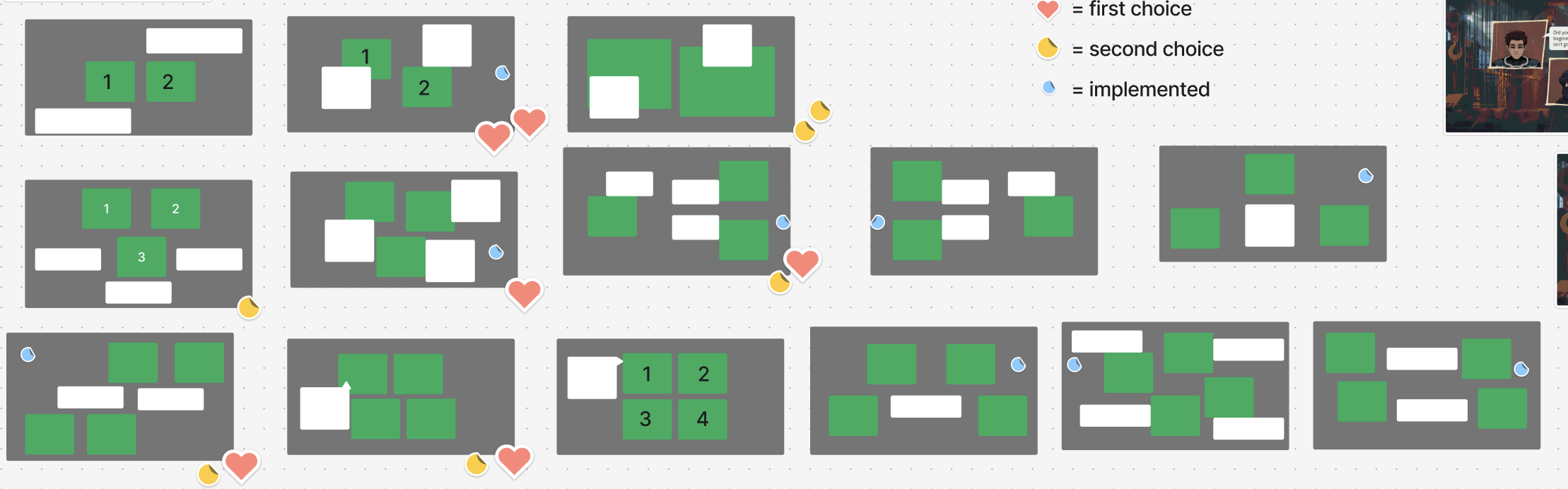
So, my heart aflutter and spirit in want, I spent a day doing a research dive into various dialogue layouts (bless the Game UI Database!!) to see if any other games had managed to pull this character art perspective off. I ended up with this massive non-chronological taxonomic tree:
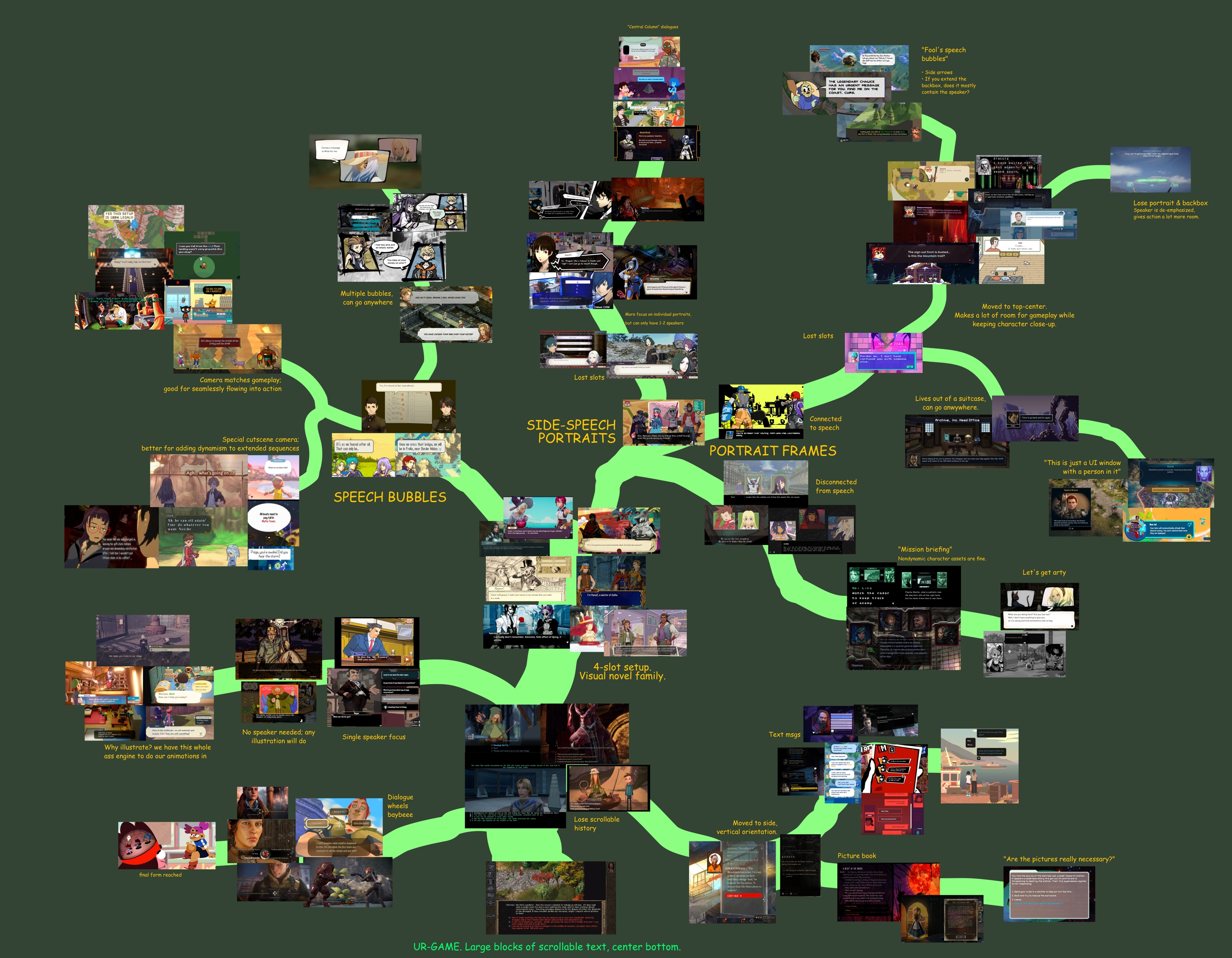
The type of layout that particularly caught my eye was this style where each character had their own little box. These layouts borrow a concept from comic books called "closure" where the space and time between characters are left blank. Freed from the constraints of trying to simulate a single space, these layouts allow the reader to fill in the blanks with something that feels more true-to-life than anything we'd be able to render ourselves.
I was especially impressed with the dynamism of Tales of Symphonia and The World Ends With You; rather than sticking to single slots they would animate the entire panels moving around to indicate motion an relative position of characters.
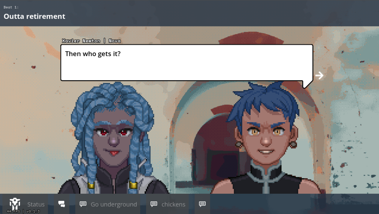
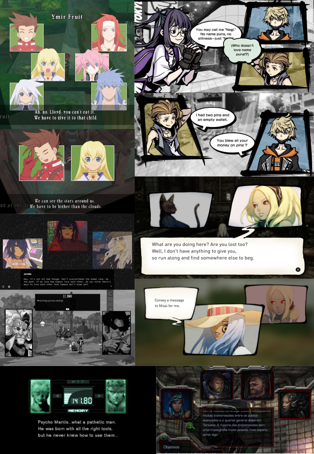
So we threw out the old code and copied them. Here's what we've come up with:
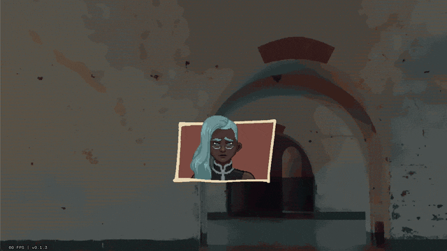
We'll be able to have portraits interact, like smacking each other (I felt like a kid hitting two action figures together, lol)
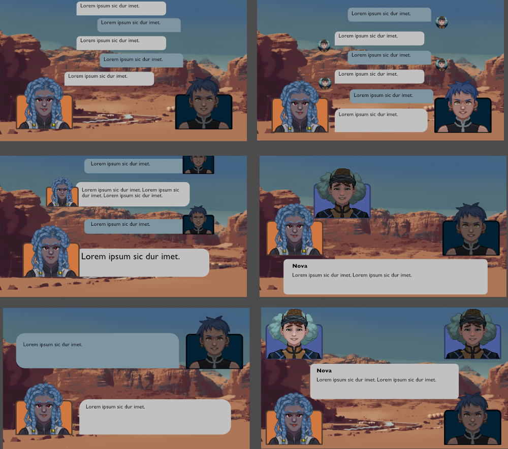
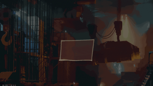
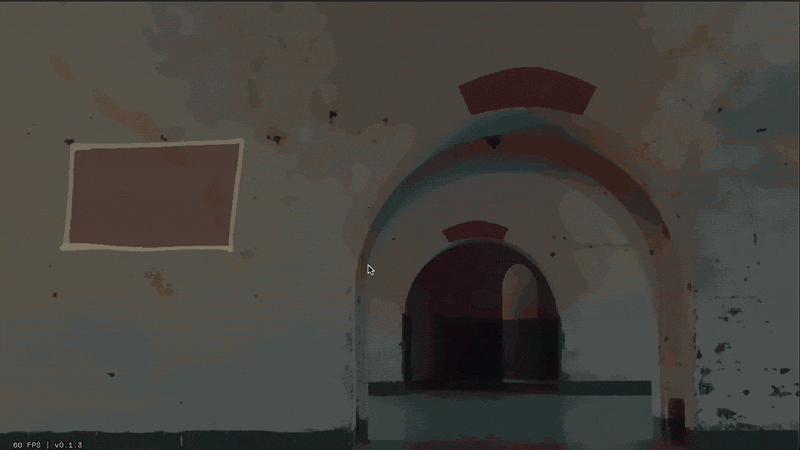
We can also apply effects like princess-leia-holograms and full-screen "lighting" effects like warning banners:
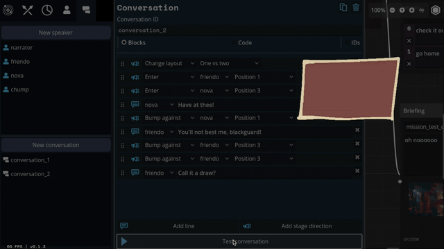
Carpenter and I came up with a number of arrangements that the portraits can smoothly transition between:
I've also implemented support for choices during a dialogue, potentially leading to branching paths.
Overall, I feel so so much better about this system than our initial designs. It might feel a little more cartoony, but I think we're making a cartoony game so that's not a problem.
Whew. We bit a lot off to chew with this project. I feel like I just made a second visual novel game engine inside of the first.
Other changes
- Added a buncha polish to the Trigger tool; faster rendering, categorized effects, ability to minimize blocks, and exposed event flags.
- Better save/load dialog for combats and missions; can just give it an ID instead of messing around with manually making folders. This took like a full day of UI drudge work so even though it's not sexy it gets a bullet point.
- Made an example module, and a "play module" screen from the main menu.
- Got module editor stable-ish enough to do a release with it.
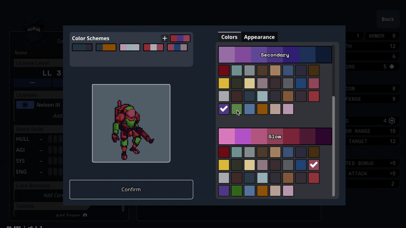
- Mech recoloring! And preview colors on hover instead of only on clicking.

New build + schedule
Version 0.1.4 is available here for backers.
As I threatened last update that we might do, we're pushing the target release of the "bones" version back three months to February/March next year. It'll likely be the version we finally make available on itch.io as a beta (as opposed to these alphas y'all are getting). Between here and there, our main objectives are:
- Remake the tutorial from the initial demo
- Get 2 frames + licenses per manufacturer at least mostly implemented. (we're currently about halfway there)
- Do a major bug & polish pass, finishing up WIP screens like the license picker in the character screen.
Until next time!
Olive
Comments
Log in with itch.io to leave a comment.
You realize that dropping a huge number of interesting screenshots without titles is a horrific nerdsnipe, right?
Haha I'd never thought about that. It takes so much time to crosspost these damn things across different formats and platforms I dunno how feasible it'd be to write and preserve them... but I'll see if I can remember to do it next time.
Even just annotating the diagram itself might work! Probably doubles the amount of work involved, though.
OH I thought you meant putting title hover text on all the images in the post, not just putting the game names in that big diagram. Yeah lol I definitely regretted not doing that almost immediately when I wanted to go back and look up specific screens.
So I finally made it through at least 1950 of the 1973 pictures in the Game UI Database's Dialogue page - it's being weird, so I don't know what 23 I'd be missing - but I haven't found the one I was most looking for, namely the snarking about a coffeeshop customer demanding satisfaction with a katana for not being allowed to have 10 espresso shots at once. Do you recall what that one's from?
That's Necrobarista! I probably specifically went and searched it out because I remembered it being stylish, rather than finding it in the database. Sorry you went through all that trouble! 😅
The Phoenix rises...I love the new look for character dialogue! Well done!
learnt a lot about different stylistic methods of textbox design and effects from this. I really like the look of this.
That's quite neat!